Today (4/22/2010) is the 40th Earth Day so it’s probably appropriate to mention how you can help the environment with little or no effort on your part. How? Simple, change your default font for printing.
Each font displays characters in a slightly different way. Some have serifs (the little tails on the end of the letters), some have thick lines and some thin, some are fancy while others are quite plain. How fonts display on a monitor will have no real effect on the environment but when it comes to printing, it’s another story. It takes little imagination to see that a font with thick lines will take more toner or ink to print than a font with thin lines.
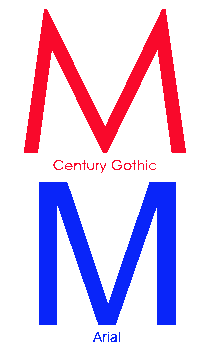
So, basically, all you have to do is pick a font for printing that prints using less toner or ink than the font you are using now. The effects of this can be seen in the figure below…

Font Comparison
Many people use Arial; changing that to Century Gothic will produce letters with a smaller area of ink when printed. The figure above shows the letter M in both fonts at 200 point size. Note that the lines in Century Gothic are a bit thinner and the angles in the letter are acute in Century Gothic but squared in Arial.
Similar comparisons can be made with serif fonts. Just pick the font that uses the least amount of ink or toner but still looks good at the size(s) you typically use.
That’s it. Just change fonts and save the planet. Happy Earth Day.